Exploratory Data Analysis on Computer Security
 Looking into log files can help computer security experts identify threats. However, it would be expensive if we rely on human to do collection, observation and analysis. Data Science can help automate this task …
The goal of the experiment is to be able to provide a Real-time Automated Dashboard (RAD) that security analysts can observe to look at visuals describing the security state of a certain systems observed. The visuals will be properly labeled and make use of colors to distinguish normal state versus “possible exploited” state. Ideally, all graphs will be created from R objects that have been cleaned and processed for exploration. The aim is to be able to create meaningful information that can be used for decisions and further understand the system in real-time.
Another goal of the experiment is to create standard R-packages that would aid in creating exploratory graphs. The design would take all variables in consideration and provide the user to choose which variable goes on the x or y axis at a specified scope in time. Graphics can then be displayed to alongside each other for comparison, as long as the user specifies a slice or scope of time to be observed: varies from real-time minus delay or exploratory for historical data.
RAD will compose of multiple views of multi-variable data. A set of presets can be defaulted to having three sets of 2 x 2 graphs that shows random combination of variables from a certain R dataset. The user can then select particular variables to show up for customized graph for observation: below are sample graphs created by an R package ggplot. For more information, visit http://docs.ggplot2.org/current/.
sample dashboard panel:
RAD will be composed of visual graphics created from R data sets and they provide summary of the data in real-time and historically. Analysts can use these to further look into certain data that collaborates their hypothesis or establish doubts and provide enough evidence to rule out some generalizations.
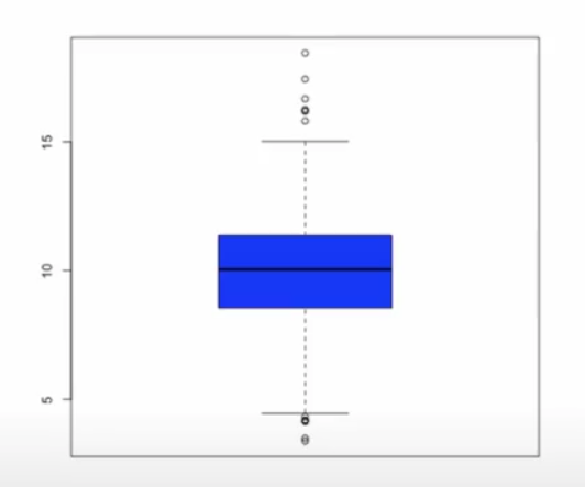
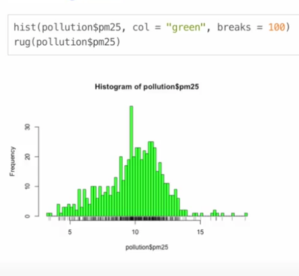
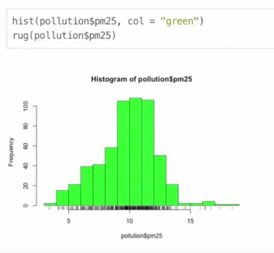
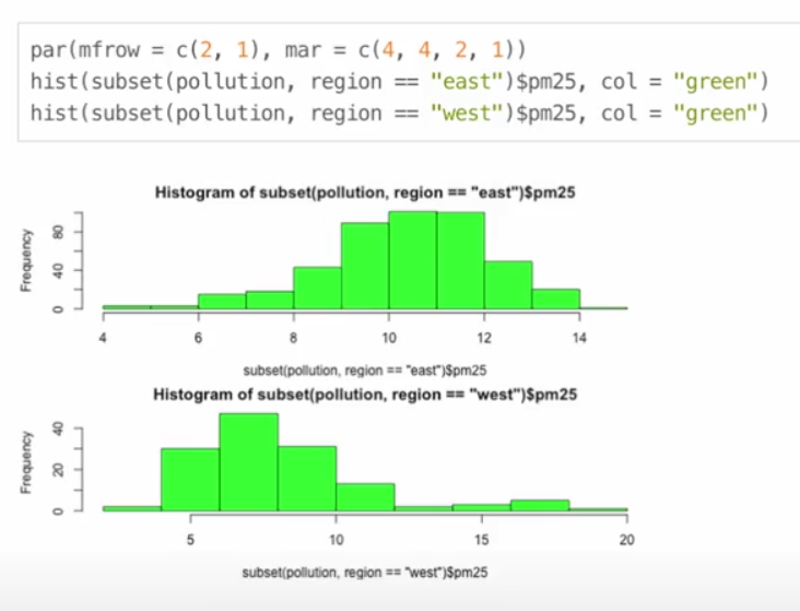
One-dimensional summaries of data include: boxplots, histograms, density plot, and bar plots:
Two-dimensional summaries of data include:
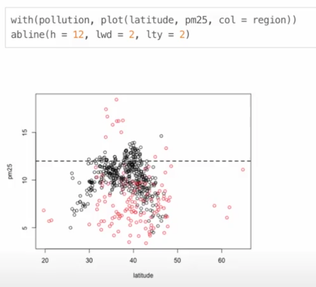
- overlayed 1-dimensional - overlay shows other variables along with any of the previously listed 1-dimensional summaries in order to provide visual basis for comparison
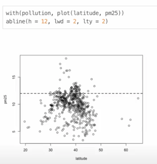
- scatterplots, smooth scatterplots